




Redefining contemporary print media through timeless typography, bold layouts, and curated visual narratives.
Modernist Quarterly approached us to revitalize their flagship publication, which had been struggling to maintain relevance in a digital-first landscape. Their legacy was deeply rooted in mid-century modernist principles, but the visual language felt dated to contemporary audiences.
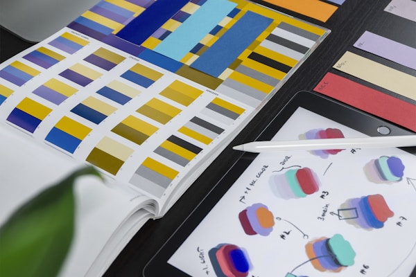
Our mission was clear: honor the foundational design ethos while injecting a fresh, dynamic perspective. We restructured the grid system, refined the typographic hierarchy, and introduced a sophisticated color palette that bridges retro minimalism with modern editorial standards.
The result is a publication that feels both archival and avant-garde, earning critical acclaim and a 35% increase in subscriber retention within the first quarter post-launch.
How we transformed a legacy publication into a contemporary editorial experience.
Revitalize a heritage brand without alienating its core audience. Balance modernist minimalism with contemporary readability and digital cross-platform consistency.
Conducted reader audits, analyzed mid-century design archives, and developed a modular grid system. Established a strict typographic scale and restrained color hierarchy.
Designed 48-page spreads, custom mastheads, and pull-quote systems. Collaborated with photographers to ensure visual cohesion across print and digital touchpoints.
Shortlisted for Print Magazine Awards 2024. 35% increase in subscriber retention. Expanded digital archive engagement by 60% through unified visual identity.
| Client | Modernist Press |
|---|---|
| Year | 2024 |
| Category | Editorial Design, Art Direction, Print Production |
| Team | 3 Designers, 1 Project Manager, 1 Copy Editor |
| Software | Adobe InDesign, Photoshop, Illustrator, Figma |
| Deliverables | Full Publication Layout, Brand Guidelines, Digital Assets, Print Files |


